Monday, 2 December 2013
Tuesday, 30 April 2013
Thursday, 18 April 2013
parts of my trailer that is similar to my style model shutter island
The use of a patient within my film is apparent, such as within shutter island.
My patient is more in a younger and postmodern context, as you can see from the age of my actor and the patient clothes in which he is wearing. There are no handcuffs such as the style models patient in Shutter Island.
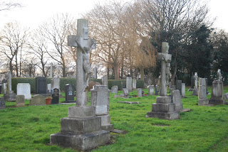
This is the island/ isolation apparent in shutter island, and I have recreated this isolation into a more eery atmospher. As I have used a graveyard for my setting.
This is my actor in the setting.
Shutter island has also used props to display the discorded patient, and put them in context to the films genre and their surrounding prison.
I have produced a similar prop for my film, however my image is in context to a less violent patient with a mind disorder.
Here you can see the patient notes I have created.
Shutter island also uses questioning as key motif for the film, i have done this is a similar fashion. Although I have a female character without a face to reference from. It is also used to help describe the main content within the film, rather than help establish the persona of the distorted investigator in shutter island.
Again with the motif of notes in Shutter Island, my film also uses them to help establish a possible narrative, or possible subtext.
Friday, 12 April 2013
Main image
This is the main image I have taken of my character in context to the films location.
I have made the actor sit in the particular position to make continuity become apparent throughout my main trailer and the magazine. I have also allowed a lot of blank space for text and heading for a magazine.
I have made the actor sit in the particular position to make continuity become apparent throughout my main trailer and the magazine. I have also allowed a lot of blank space for text and heading for a magazine.
Tuesday, 19 March 2013
poster for film
Firstly I searched through texture packs to find a creepy, and rustic feeling texture to apply to my background creation for the poster. I then added a variety of low exposure and black and red low opacity blur brushes. To therefore make the rustic feel, become more darker and dramatic, to catch the eye for the audience/ potential consumers for the film I am promoting. 

I then added the Franchise logo, this being 'Expire'.
I also added a web URL for the web page, also I added a Facebook and twitter logo. This is to gain potential publicity to my film and gain a fan base on line through multiple mediums and convergence. Finally the date of the film release is a fundamental aspect to a poster, so I have added the release date to suit the dramatic and contrasting colour scheme.
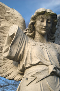
For the selection of the image, I chose the most detailed, however recognisable image. In this case this is the picture of the angel. I then changed the background of the image, so that I could overlay the image onto my previously created background.
This is a logo in which i have changed the background so that there is no background. Also I have changed the opacity to 67% to overlay onto my background. And finally I have changed the layer levels , so that the text goes on top of the image, therefore making it visible.
This is my final poster.
creating my film poster
For this I began by taking images of models/ props which are relevant to my media film trailer.
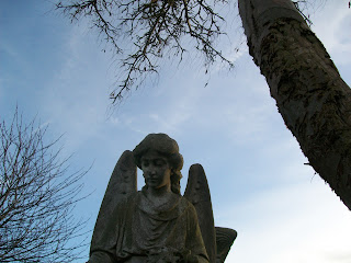
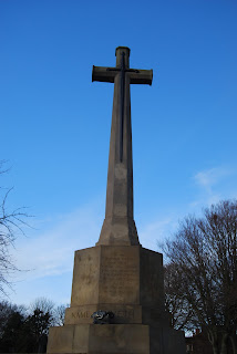
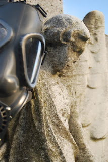
Here are images I have taken for use within my media film, and film poster/ advertising.
Here are images I have taken for use within my media film, and film poster/ advertising.
Subscribe to:
Comments (Atom)


