Firstly I searched through texture packs to find a creepy, and rustic feeling texture to apply to my background creation for the poster. I then added a variety of low exposure and black and red low opacity blur brushes. To therefore make the rustic feel, become more darker and dramatic, to catch the eye for the audience/ potential consumers for the film I am promoting. 

I then added the Franchise logo, this being 'Expire'.
I also added a web URL for the web page, also I added a Facebook and twitter logo. This is to gain potential publicity to my film and gain a fan base on line through multiple mediums and convergence. Finally the date of the film release is a fundamental aspect to a poster, so I have added the release date to suit the dramatic and contrasting colour scheme.
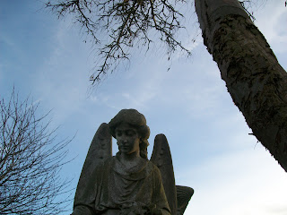
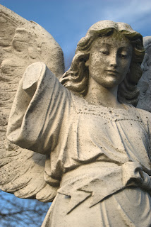
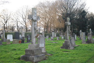
For the selection of the image, I chose the most detailed, however recognisable image. In this case this is the picture of the angel. I then changed the background of the image, so that I could overlay the image onto my previously created background.
This is a logo in which i have changed the background so that there is no background. Also I have changed the opacity to 67% to overlay onto my background. And finally I have changed the layer levels , so that the text goes on top of the image, therefore making it visible.
This is my final poster.


