Wednesday, 19 December 2012

Researching types of horror posters, to decide on the style model for my magazine.

Firstly I have researched just the standard horror film magazine,
And after looking at several results, that google have shown me. I have decide on the style model 'Empire'. As empire are a well established and internationally recognised company. 

 (here is a screen shot of the results from my search onto the search engine google).

WIKIPEDIA SEARCH FOR BACKGROUND INFORMATION:
In common with most British film magazines, Empire is populist in both approach and coverage unlike less irreverent and more 'serious' magazines such as Sight & Sound. It reviews both mainstream films and art films, but feature articles concentrate on the former.
As well as film news, previews and reviews, Empire has some unique regular features. Each issue (with the exception of issues 108 – 113) features a Classic Scene, a transcript from a notable film scene. The first such classic scene to be featured was the "I could have been a contender" scene from On the Waterfront.

I have picked this particular magazine company to base my style model, as they specifically incorporate, and manipulate each magazine every month to have a specific and different style which links into the film in which they are portraying. As I have highlighted within my research. You can also see the unique attributes for each magazine cover, in the following images which I am using for a style model. 


Within these masterpieces, they can be deconstructed to show the unique qualities in which they portray.

For the first image, this being a cover for the film 'Tron Legacy', Empire have easily engaged the attention of the type of audience for the genre of film in which it is. To do this they have suited the style of the films genre with the colour scheme on the magazine. They have used a sci-fi neon blue to compensate with the fictional content of the film, to allow the audience to relate to the magazine, and therefore buy the magazine.  They have also shown off the main character of the film, so people can relate to the genre from the costume, but it can also make fans buy the magazine.

The second magazine, for the film 'twilight', has a dark and sensitive theme, to compensate for the fictional genre. And there is a distinct image of the main character of the film, as stardom from this actor creates more profit, and more likely hood that a fan will buy the magazine.
The final magazine shows off the stylistic feature of a sci-fi thriller called 'Hell boy'. This magazine uses a colour tone of red throughout the magazine. And therefore allows the sense of the films motif, fire. To com across greatly. I have chosen this final magazine to base my magazine on, as I love the way that Empire have used a texture on the main title of the magazine. 


Saturday, 15 December 2012

creating my own take on an EMPIRE magazine title for my magazine

I have picked  various textures online, to add to my title of my magazine, to give it that unique aspect just as within my style model 'Empire'.


To add these to my title I have highlighted the solid format of the text box 'LEGACY', using the quick selection brush. I have then cut the image out by changing the layer, placing the texture on top and then cutting the texture out and deleting the excess.

Here are screen shots of me creating the title.
This is the original template I have created for my magazine cover.

And this is the quick selection wand above.


This is the highlighted piece of text I have used the wand/ brush tool on.

This is what it looks like when I applied the texture and cut it out.

This is my cover without my main image.


Tuesday, 20 November 2012

Paying to see silent hill as research

I have been to the cinema to see silent hill revelations 3D and I was blown away with the size of the audience and the demand for this film. This demand and response has concreted my choice to make my film extremely similar to Silent hill Revelations 3D.


MY Review:
This Film portrayed a dramatic and thrilling experience for me, as a previous fan from their first film 'silent hill'. There was a mixture of creepy and captivating visual props used, and this is furthermore maintained with a melodramatic dialogue. The storyline to this film was at sometime over complicated, and the relevance to a regular consumer/ audience with no previous experiences with the silent hill theme or pot, would find this film very complicated and misunderstanding. Mainly true fans of the game series and films would understand and enjoy the dialogue.

Adelaide Clems (seen on the right hand side above), portrays the character of Heather Mason to a great extent. The film also adds a great emphasis as it is 3D, this latest enhancement brought on by the recent technological convergence has greatly brought out the overall creepiness of the film.

Review from online:


 would like to start this review off by saying that while I was excited to see Silent Hill: Revelation, at no point did I expect it to actually be any good.  The lore and intrigue of the Silent Hill game franchise was enough for me to see it in theaters. And if I’m being honest, I really liked the first movie and was curious to see what they did to continue where it had left off. I thought at the very least it would have a cool look to it and maybe even be a bit scary if it was done right. Which it wasn’t.
Silent Hill: Revelation does an excellent job at making you think it knows exactly what it’s doing. By that I mean, visually the film has the look you want for an adaptation of the now classic survival horror franchise. The Silent Hill 3video game is the obvious inspiration at a glance, if the wardrobe of the lead character doesn’t give it away instantly, the visuals of a nightmare carnival will.  Lead actress Adelaide Clemens does a good enough job at filling the shoes of the game and movie protagonist Heather.  The infamous Silent Hill Nurses as well as Pyramid Head are on hand to help push this little caboose of a movie along, and while they are certainly creepy, they aren’t enough to salvage this film. That’s about as far as you can go for rattling off the movies good points.
The storyline at best is completely cliché and feels as if the whole film was a giant improv experiment, without any of the humor you would expect to get from that. It’s cliché to the point that the character of a private investigator is wearing a trench coat and a Fedora, which I’m pretty sure has been a plot device played out since at least the 1950s. The dialogue sounds like it was either made up on the spot or no one took the time to practice their lines. Not that I was expecting a stellar performance from anyone, but it would have been nice to get the impression that they cared enough to try. Without giving away any spoilers it’s hard to adequately express just how many holes and “WTF” moments of confusion the plot holds for unsuspecting viewers. Let it be known that there is a plot twist and if the movie was made with even just a little bit more T.L.C. you could find yourself being surprised. Instead you end up cocking your head to the side and thinking, “Did they really just do that?”. As if the story doesn’t have a hard enough time pulling things out of thin air and making up bridges to place between the video games and itself, there’s also an awkward romance that’s just painful to watch. Yeah, if you’re thinking it doesn’t belong in that universe, you’re absolutely right.
One important thing to note is that this movie was released and filmed with the intent of being shown in 3D. I was unable to see it opening weekend, and instead went a week later. I checked four theaters and only found one showing the 3D version of the film and it wasn’t playing until late on a Sunday night. I opted to just see the movie in a normal format and thought that would work out fine. I was wrong. There are several gags (I say ‘gags’ because the movie is a joke) that are clearly meant to take advantage of the jump-out-and-grab-you style of 3D films… that we watched in the 90s. There’s even a point where a terribly placed blood splatter stays on the screen and drips just long enough for you to dramatically role your eyes. The creators of JAWS 3D wouldn’t have stooped so low and that’s saying something.
In short: save your money. Wait until 6 months from now when it’s playing on a movie channel for free. Wait until you’re lying on your couch, so sick that you had to call out of work or school, and have nothing else to do with your time . A fever may be just what Silent Hill: Revelation needs to be worth watching.

Friday, 9 November 2012

finding my location

I have google local churches and I have obtained there phone numbers, addresses and emails.

http://uk.local.yahoo.com/Merseyside/Wallasey/Churches/uk100006150-s-39017.html

I know need to find a church that will let me film my film.

I have produced a letter to give to the church owner.

making draft poster for my media trailer

This is the beginnings to my draft poster for my 'film'. For this I have explored and edited pictures of flames, and then I have edited them to fit my poster conventions. I have used flame to symbolise the devil and give a super natural feel by using upside down crosses.

I will now add a picture of my model 'Anna', as she is the central demonic character and she will fit into the conventions of the poster, in her full costume.

My style model is based on the silent hill movie poster above ^^^^^^


Behind the scenes of creating expire the draft pictures


Here I am applying red acrylic to represent blood on low exposure picture

Here I am applying red acrylic to represent blood on low exposure picture


Here I am applying red acrylic to represent blood on low exposure picture


Wednesday, 7 November 2012

Draft filming

I have produced a draft film trailer, so I can establish what the experience will be like in the actual filming of my real trailer.

This is my draft trailer...Note that the image of the church will in fact be a real one.

Thursday, 1 November 2012

creating a mock up of the poster style I want to achieve.
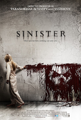

Here is a mock up of a poster template I have made on micro soft publisher.

I would like to try to follow these conventions, as it is very clear.

conventions of a film poster- Research

I have looked over various sites to find information on the conventions of a poster, and I have looked at various style models which portray these characteristics. This is to therefore influence my film poster decisions.

A good website, which I have found from research is :

http://www.colorpilot.com/comp_rules.html

This particular website shows the composition rules needed for a photograph.


Conventions of a Film Poster:

  • It must be eye catching
  • It must portray a focal picture, that will be unique and grab attention
  • The title of the film must be large, within the frame
  • It should show off the films genre greatly
  • It should focus on the main character, and show their portray within the film
  • It should have a tag line
  • It can contain the age rating, as it has to be informative
  • It should have a coming soon sign, or even a date
  • The Director and Production company should be displayed.
Researched poster:


I have now applied this research and shown I can identify the conventions myself:


Poster before i have shown the features/ conventions:


And after:


Monday, 8 October 2012

My cast

Getting my cast:


This is Jess, he is 18 and he wears the style of clothing similar to what I want to portray:
This is him before his dream state/ immersion in the trailer for my film.

I had to arrange a time table for my cast also and this will be shown at the bottom of this blog.


For the demon girl I have picked a teenage girl who will fit the criteria of my imaginated idea.

This is Anna, and she will be dressed in a gas mask which I have purchased, but also a green cardigan that I have purchased from a charity shop.

Wednesday, 3 October 2012

director of Shutter island inspired me due to his success:

The director of shutter island is Martin Scorsese, and he is a well known and internationally recognised film producer. And this adds emphasis to the reason why i have chosen psychological thriller. Ad Martin shows that they are successful.

He has produced films such as Goodfellas, Shutter island, The departed and Hugo. 
All of this films have a very high income of money, and they where all pro vend to be successful.
(Above this text is a list of all the films in which he has produced.)


creating props for my media trailer:

Here is a copy of the fake patient note prop, In which the Dr will have in the shot.

I will also produce an image of Frank looking creepy and isolated within himself internally.


Tuesday, 2 October 2012

thinking about costumes:

For the chracter of frank I will look for a normal atire of clothing, as he is a younge male/ old teen. therefore i wil need to keep with the natural clothing, this is so that othere boys/teens his age can relate to the mis en scene and attavh themselves with his situation.


For the character of the doctor, I will just allow them to wear black casual clothing, as they are only shown from over the shoulder, so there costume is not as relevant.


For the character of the possesed girl, i am following the style of the girl from the grudge.

(here is a make-up tutorial to give me an example of how i will do the make-up for this character, although I am adding red crosses to the girls eye lids and palms, with blood dripping from the eyes, to create my  own style, to fit the demonic curch girl theme)


If you have not seen the grudge here is a trailer to give you an idea of what it is:


Above was my initial style of 'IT', instead of this I have actually purchased a gas mask, to eliminate any facial features. Therefore questioning who she is underneath the mask.

Thinking about locations

As my location is set within the church setting I preferably need a church to film in for my main location.

I have been exploring the type of setting I will look for, and I have found images to use as an example of what I would like to use in the actual film.

Her is an example of the type of church settings i would like to use within my church: